Mastering the Airbend Dashboard
The Airbend Dashboard is the central hub for managing your air conditioning systems, providing real-time data, advanced filters, and actionable insights. With an intuitive layout and powerful features, it’s designed to help you make informed decisions quickly, ensuring efficiency, comfort, and optimal air quality across all your locations.
What You’ll See on the Dashboard
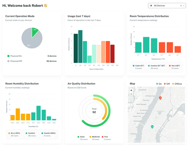
When you log in to the Airbend Dashboard, you’re greeted with a comprehensive overview of your system:
- Real-Time Device Status: See which devices are running, powered off, or disconnected.
- Environmental Conditions: Monitor temperature, humidity, and air quality across rooms.
- Operational Metrics: View runtime, power states, and energy usage trends.
- Map Overview: A geographic visualization of device statuses by location.
With this rich data at your fingertips, you can quickly identify areas that need attention and take action immediately.

Key Benefits of the Airbend Dashboard
1. Filter, Investigate, and Resolve Issues
The Dashboard makes it easy to pinpoint and address problems:
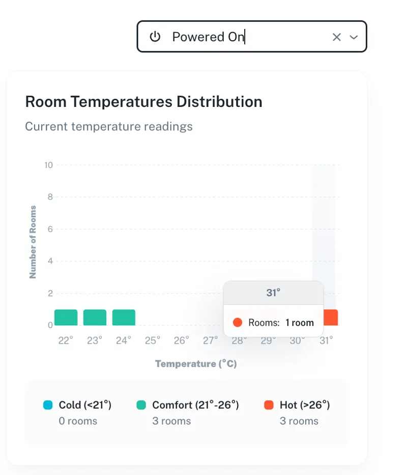
- Filter AC Units by Power State: Identify all devices currently running, then cross-check room temperatures. Are there any rooms that are still hot despite the AC being on?
- Analyze and Act: Click on a specific device to analyze its performance and environmental data. Is the window open? Is the AC malfunctioning? If needed, you can send a technician to investigate.
- Disconnected Devices: Filter devices that are offline to ensure they’re reconnected promptly, avoiding disruptions.
Example:

A room shows high temperature and poor air quality despite the AC running. Upon inspection, you notice the device is consuming power but not cooling. This insight helps you take immediate action by dispatching a technician or investigating external factors like an open window.
2. Monitor Runtime and Optimize Usage
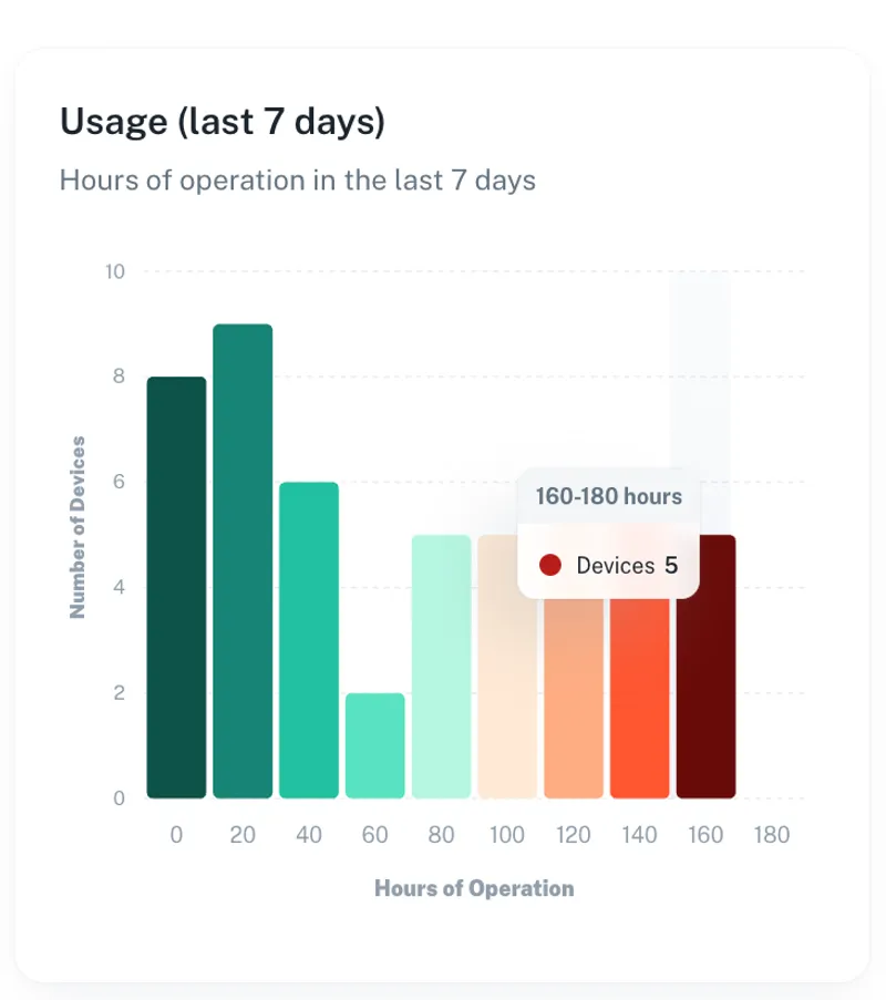
Track how long each device has been running to identify inefficiencies:
- Spot Overused Units: Highlight devices with excessive runtime and investigate if they’re running unnecessarily.
- Improve Scheduling: Use runtime insights to adjust policies and schedules, ensuring energy isn’t wasted during off-hours.
Example:

A device in a meeting room is running continuously, even at night. By adjusting its schedule, you save energy and reduce wear on the unit.
3. Ensure Optimal Air Quality
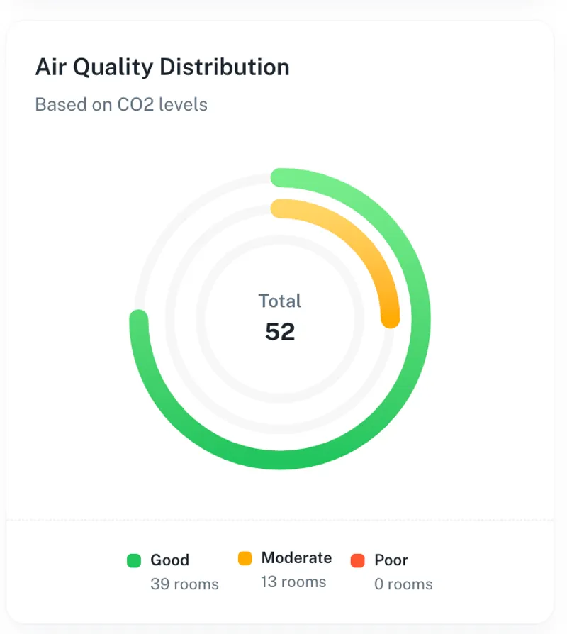
The Dashboard allows you to monitor air quality in all rooms, helping you maintain a healthy and comfortable environment:
- Filter by Air Quality: Quickly identify rooms with poor air quality metrics like high CO₂ levels or low humidity.
- Take Action: Adjust ventilation or AC settings, or investigate factors like occupancy or device malfunctions.
Example:

A classroom shows elevated CO₂ levels. Using the dashboard, you can increase fan speed or adjust ventilation settings remotely, improving air quality without delay.
4. Geographic Insights for Multi-Site Management
For businesses managing multiple locations, the map view is invaluable:
- Quickly Check Locations: Navigate between buildings, floors, or regions to see device statuses and environmental conditions at a glance.
- Filter by Specific Criteria: Focus on a particular site’s powered-on devices, disconnected units, or temperature outliers.
- Compare Performance Across Locations: Use graphs to analyze trends in usage, air quality, and energy efficiency across sites.
Example: One location shows significantly higher energy consumption. By diving into its dashboard data, you discover devices running inefficiently or outside of policies, enabling you to address the issue proactively.
Advanced Features for Proactive Management
Graphical Insights for Filters
When you apply filters, the Dashboard generates graphs to visualize data trends:
- Device Performance: Compare power states, runtime, and usage trends for filtered devices.
- Environmental Trends: Analyze temperature, humidity, and air quality over time in specific rooms or across entire locations.
- Energy Efficiency: Identify patterns that contribute to excessive energy consumption.
Example: Filter all devices running in “Cool mode” and compare their runtime graphs. You notice one unit operating significantly longer than others, prompting further investigation.
Empower Your Operations with Airbend Dashboard
The Airbend Dashboard isn’t just a tool; it’s a command center for smarter air conditioning management. With its ability to filter, analyze, and provide actionable insights, it empowers you to:
- Quickly address issues like hot rooms or poor air quality
- Optimize energy usage with informed adjustments
- Manage multiple locations seamlessly and efficiently
The result? A system that runs more smoothly, consumes less energy, and delivers superior comfort to your spaces.
Ready to take control? Dive into the Airbend Dashboard today and experience the difference!
